Fountain Pen Nibs Compared: Fine, Medium, Broad and Beyond
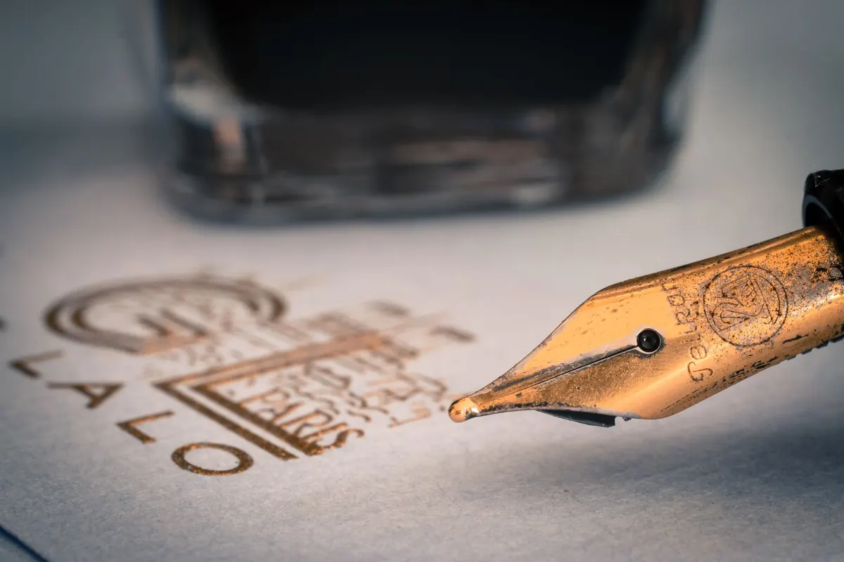
A fountain pen is only as expressive as the nib at the end of it. Two pens with the same barrel, the same ink and the same paper can feel entirely different once the tipping material changes size — one scratches out a cramped shopping list, the other glides through a signature with a wet, confident flourish. Choosing a nib width is the most useful decision you can make before buying, and it is also the one most often guessed at. Here is what the common widths actually do on the page, and how to pick the one that suits your hand.
Why nib size matters as much as the pen
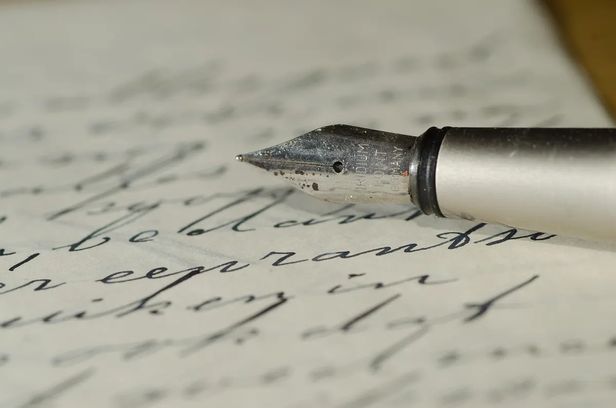
A nib does three jobs at once. It delivers ink, it sets the width of the stroke, and it tells your hand how the pen is behaving. A fine nib lays down less ink, dries faster and lets more of the paper's texture come through. A broad nib floods the page, swallows small handwriting and usually feels smoother, because the tipping material spreads the pressure over a wider area.
Width also changes how you write. Give a careful note-taker a broad nib and the letters will start colliding in the margin. Hand a broad italic to someone who writes quickly in a small hand and the loops will close up into solid shapes. And the same nib can look two sizes apart depending on what you feed it: a wet ink on absorbent paper can turn a medium into a broad within a sentence or two.
The standard widths, from needle to firehose
Extra fine and fine
Think roughly 0.2–0.4 mm of visible line, though makers vary. These suit small handwriting, margin notes, annotated books, cheap paper and forms with cramped boxes. They reward a light touch and punish a heavy one — press hard and a fine nib will dig in and skip. Left-handers who push the pen across the page often get on well with them, since less ink means less smearing. Expect more feedback, more shading from some inks, and the occasional dry start on very smooth paper.
Medium
The safe default, and the nib most pens are sold with for good reason. Around 0.5 mm, a medium is smooth enough for long writing sessions, visible enough for signatures, and forgiving of ordinary paper and ordinary handwriting. If you genuinely do not know what you want, start here and adjust later.
Broad and double broad
From about 0.7 mm upwards, with double broad and triple broad grinds turning into proper paintbrushes. Broad nibs are wonderful for signatures, headings, letters to friends, and showing off an ink's colour and shading. They are hopeless for tiny boxes on official forms. They also use more ink, so a converter that lasts a week with a fine nib may last two days with a broad.
A size is not a size
Japanese fine nibs commonly run finer than European fines, and even within Europe, a German medium can look broader than an Italian one. Retailers sometimes publish nib widths in millimetres, which helps, but the only reliable test is your own hand. If you are buying online, look for writing samples from the same nib size and the same ink.
Italic, stub and specialist grinds
Round nibs are the default, but they are not the whole story. A stub has a flat tip that produces broad downstrokes and narrow cross-strokes, giving easy line variation without demanding much discipline. A cursive italic is sharper and more dramatic; a crisp italic sharper still, and far less forgiving of a hurried hand. Oblique grinds suit writers who rotate the pen, with left-foot and right-foot versions depending on which way you turn it.
Then there are the curiosities. An architect grind reverses the italic effect — narrow verticals, wide horizontals — and gives a striking, almost typewriter-like texture. A fude or zoom nib bends upwards, letting you vary the line by changing the angle of the pen, which is useful for sketching. Flex nibs spread their tines under pressure for calligraphic swells, but they ask for slow writing, a light hand and paper that can take the ink. Modern flex and vintage flex are quite different beasts, and vintage nibs deserve a cautious approach if you are new to them.
Matching the nib to paper, ink and task
- Absorbent paper — cheap copier stock, some notebooks — feathers and spreads ink. Fine and medium nibs cope best.
- Coated paper such as Clairefontaine, Rhodia or Tomoe River holds crisp edges, so broad nibs and stubs look their best. Drying time goes up.
- Wet inks add apparent width; dry, restrained inks tame an over-eager broad nib.
- Ruled lines matter more than people expect. A 6 mm rule is comfortable with a fine or medium and cramped with a broad.
- Your writing speed counts too. Fast, looping cursive tends to close up with wide nibs; deliberate print handles them well.
Choosing a nib without guesswork
- Write a paragraph with the pen you already own, then measure the height of your letters. If they sit within 4 mm, look at fine or medium. If they sprawl, you have room for broad.
- Name the job. Journalling, revision notes and forms pull you finer; letters, headings and signatures pull you broader.
- Check the paper you actually use, not the paper you intend to buy.
- Read the maker's sizing rather than assuming, especially across Japanese and European brands.
- Try before you commit where you can — a pen show, a friendly stationer's tester, or a cheap spare nib unit.
A medium nib on good paper will teach you more about fountain pens in a week than a year of reading specifications.
Living with your choice
Very few nib decisions are permanent. Many modern pens sell spare nib units that screw or pull out in seconds, which makes experimenting cheap and low-risk. If you want something the factory does not offer — a finer point, a smoother broad, a proper cursive italic — a nib technician can regrind an existing nib, usually for less than the cost of a new pen. Bear in mind that custom work generally affects any warranty on the nib, so think about whether you are willing to accept that before sending a pen away.
Buy your first nib for the writing you do daily, then buy your second for the writing you wish you did. A fine for the notebook and a stub for the letters home is a perfectly sensible pair, and far more useful than one compromise nib that never quite suits either job.
Photo: Pixabay / Pexels